Case Study: Deal Kaki x AI prototyping
Experimenting with AI IDE prototyping in this project.
Project Details
Bringing In-Store Discounts into One Centralized App
Deal Kaki is an imaginary project inspired by real conversations with individuals who expressed frustrations with their shopping experiences, particularly the lack of a centralized platform for discovering in-store discounts. While online shopping platforms like Shopee and Lazada offer a seamless way to browse deals, many shoppers still prefer to shop in person. However, finding the best discounts across multiple brands and categories often requires manually searching through social media, store websites, or relying on word-of-mouth.
At the same time, businesses lack actionable insights on how shoppers engage with in-store deals. The accompanying business dashboard was designed to bridge this gap, providing product owners with real-time user engagement data to optimize their discount strategies.
Beyond UX, this project also served as an exploration into AI prototyping using bolt.new, where I experimented with AI-generated code and manual refinements to align the prototype with my Figma designs.
Defining the users
Deal Kaki serves two distinct user groups. I’ve tried to prioritize intuitive navigation, ease of discovery, and actionable insights for each.
1. Retail Shoppers: Finding Deals Effortlessly
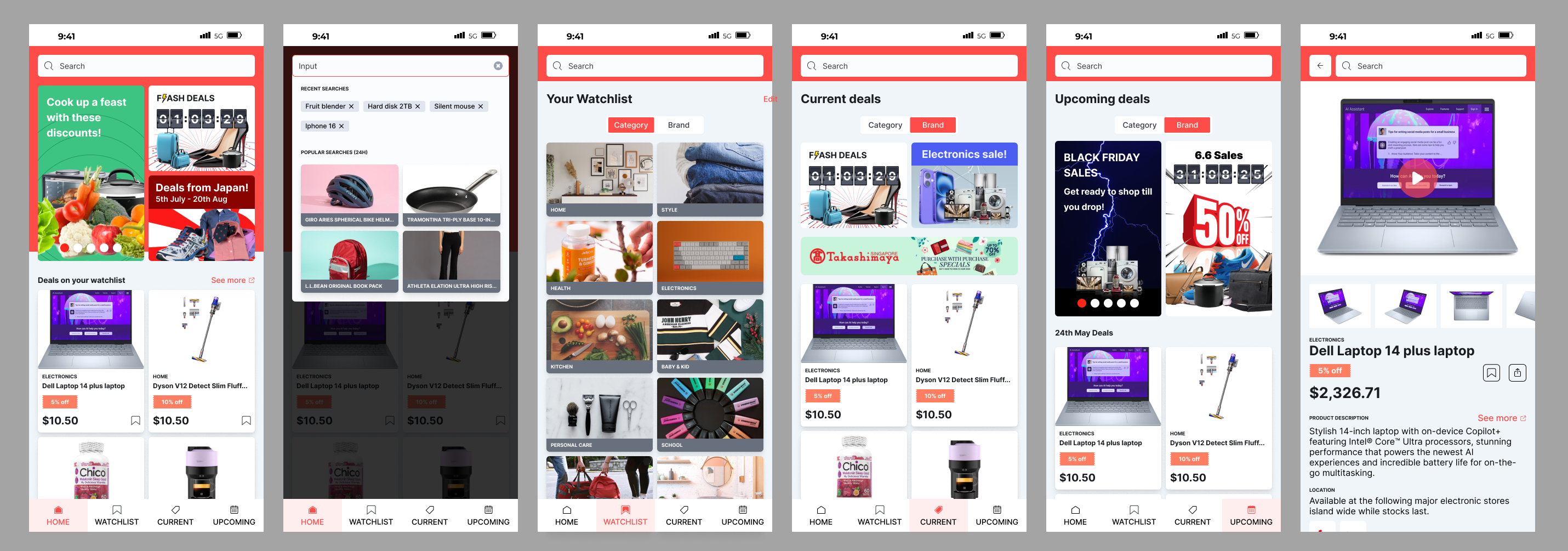
- Users can browse discounts by category, brand, or product
- A watchlist feature alerts them when their favorite items go on sale
- A discovery-driven search dropdown highlights trending discounts
- Banners break up the scrolling experience, encouraging users to explore more deals
2. Business Users: Understanding Shopper Behavior
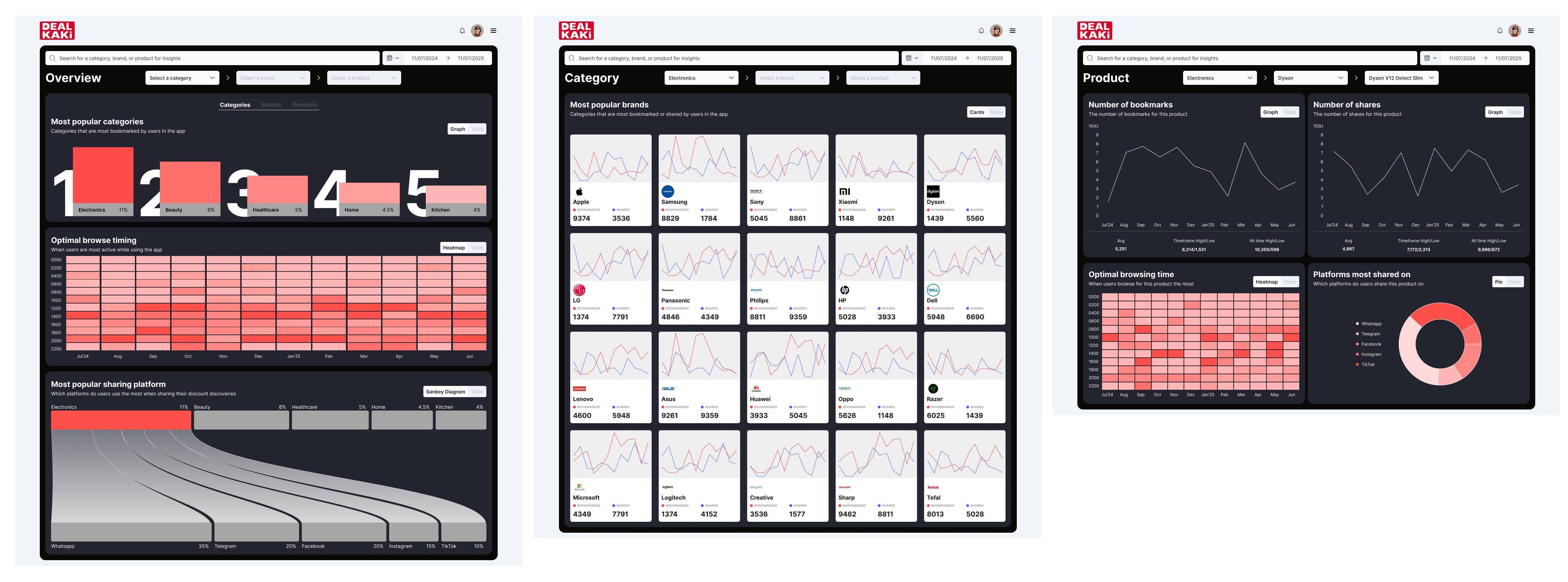
- The dashboard provides insights into:
- Which categories, brands, and products are most bookmarked
- The optimal timing for listing discounts
- Which social platforms are most used for deal sharing
- The goal was to help businesses fine-tune their promotional strategies based on user engagement data

Figma design
bolt.new prototype
Design rationale
While this project did not involve formal user research, I referenced existing shopping platforms to ensure familiarity and usability, applying Jakob’s Law (users prefer experiences similar to what they already know).
For the retail user experience, my focus was on maximizing discoverability through a structured layout, search enhancements, and visual cues like banners to surface deals effectively.
These shopping platforms usually have the following elements which I have incorporated into Deal Kaki:
1. Strong colors, which give a sense of energy and excitement to the experience. Such colors are typically reflected in their branding as well.
2. Attractive banners. Aside from breaking the monotony of only listing the items on sale, these banners help inform the user of sales which might be interesting to them.
3. Item cards. The design of these cards typically have big product thumbnails. While it creates a very messy appearance, this actually helps to give people the impression of the abundance of items on sale.
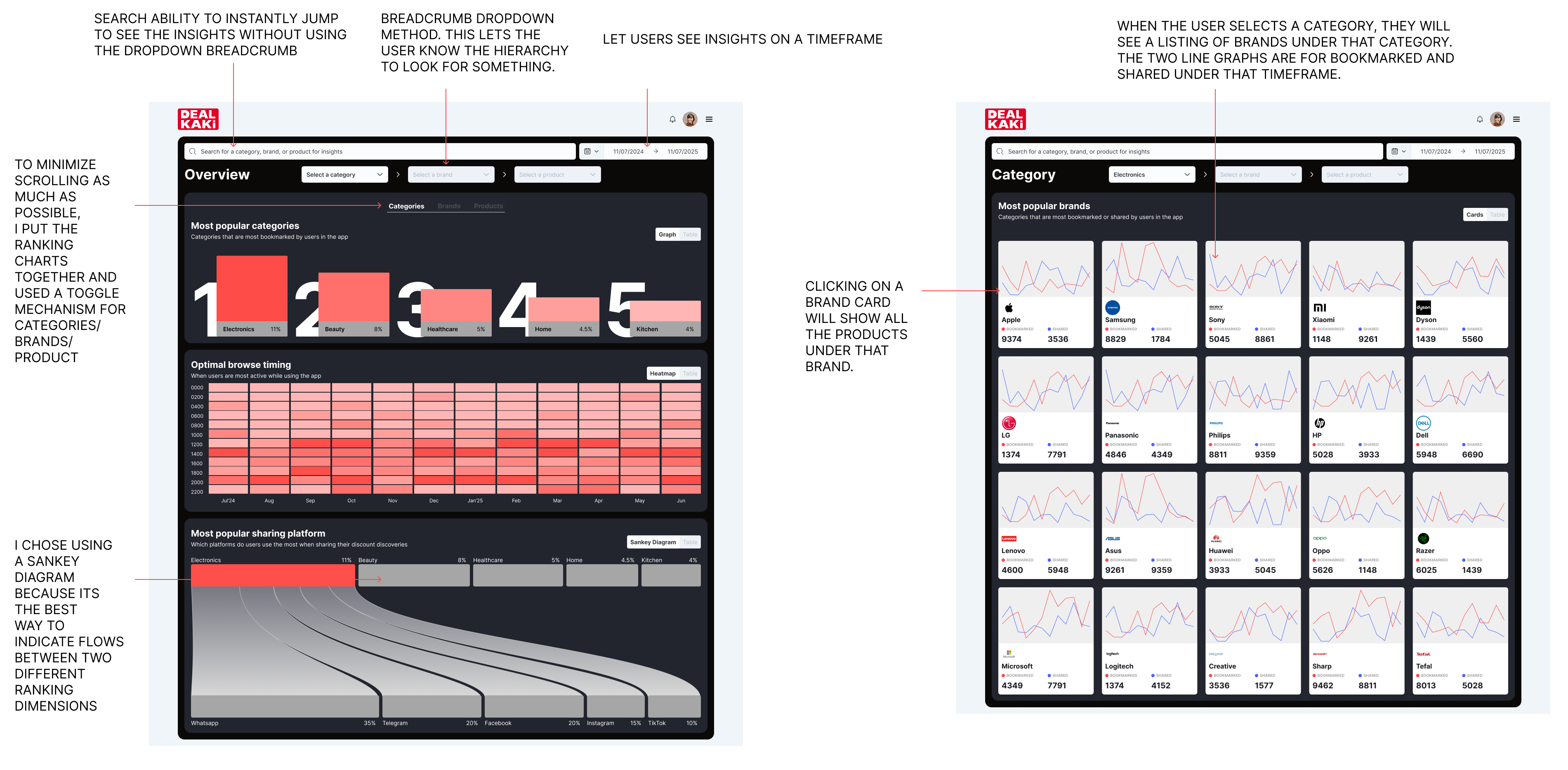
For the business dashboard, my design decisions were driven by clarity and actionability—ensuring that data points were presented in a way that business owners could immediately derive insights without information overload.


Sketching out and Wireframing
Before diving into high-fidelity designs, I began by sketching out initial ideas to explore different layout structures and interaction flows.
I experimented with different variations or key components, such as using a toggle bar component for the different sections, before eventually using a more conventional mobile menu bar when I did the wireframe designs.
Reflections
I tried to use best practices to create an intuitive design in both the mobile and dashboard layouts. Using Bolt.new was a step for me to step out of my comfort zone and experiment with using this AI IDE. What was better was that I went beyond just simple prompting and used chatgpt to further finetune the UI code.
This experimentation also gave me valuable insights into how AI can assist in the prototyping and proof of concept stage.
If I had more time, or access to actual user feedback, I would think the designs can be refined better.
Related Projects

Drive-Thru Dashboard Redesign
Role
UI/UX Designer
Project Brief
Redesigning a real-time restaurant operations dashboard to cut visual noise, sharpen focus, and support fast, on-the-ground decision-making.

Streamlining the Sign up experience
Role
UI/UX Designer
Project Brief
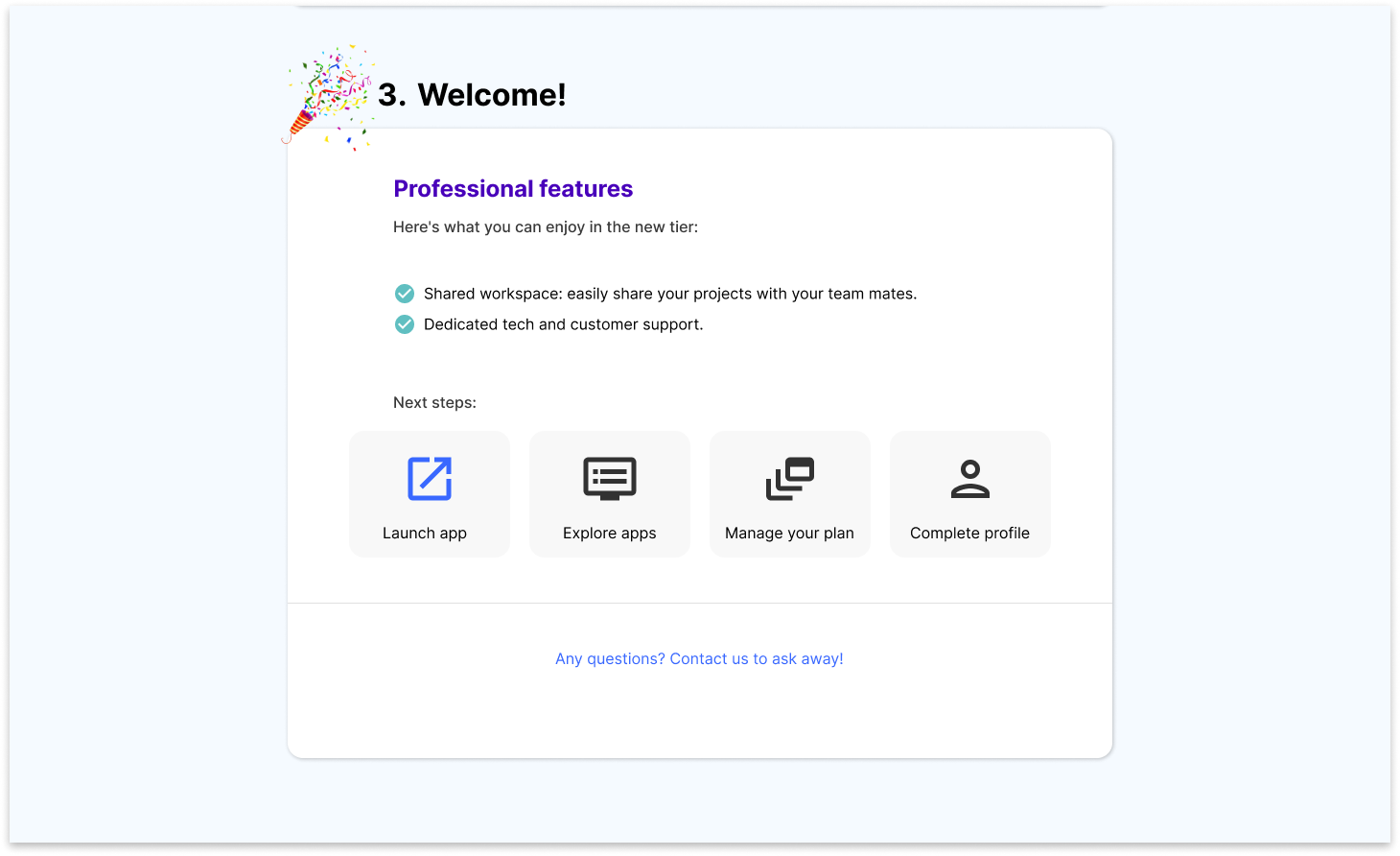
The company had received user feedback about its sign-up process being overly complicated, especially for professional users.
My role was to audit the sign-up flow, focusing on the professional tier due to its complexity, while also considering the free user tier.
During this audit, I found that the app payment and management process, closely linked to the sign-up flow, also required attention.