Sprout – A Finance Budgeting App
Project Summary
A concept project that I set for myself with the goal of designing a budgeting app.
The Ask
Designing an app that helps young to mid career professionals save and budget their finances for their saving goals.
The Approach
1. Coming up with a problem statement, user personas and insights, conducting competitive research
2. Coming up with a feature list based on my learnings
3. Sketches and changes to focus the feature list
4. Wireframes and Finished designs
The problem
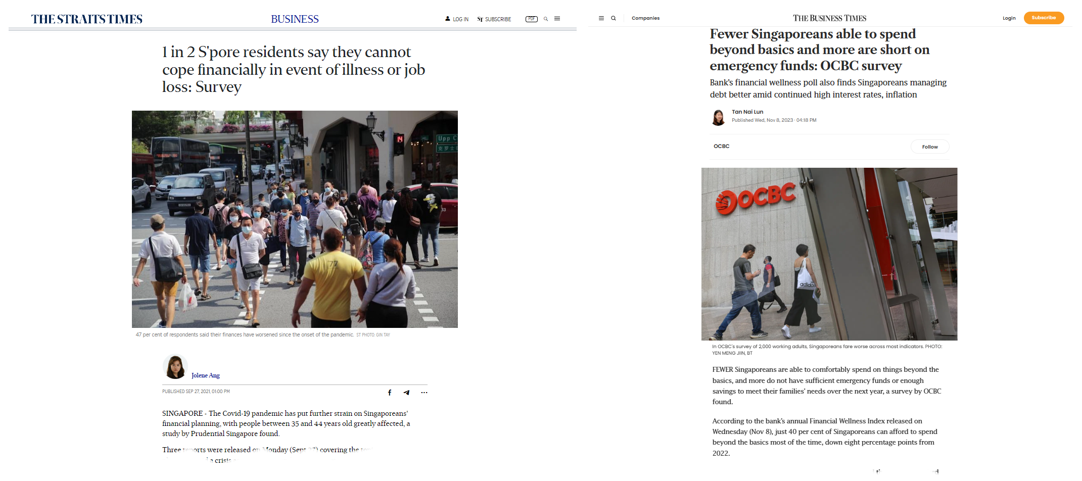
Young and mid-career professionals often face anxiety and uncertainty when planning for financial independence and early retirement. They struggle with setting realistic goals, and visualizing their progress. A lack of accessible, personalized tools makes it difficult for them to balance short-term needs and long-term aspirations effectively.
How may young – mid professionals begin their financial journey towards retirement, given that they have uncertainty over where and how to start?
The process
Coming up with research questions
- What are your biggest financial goals, and how do you prioritize them?
- What do you currently use to track your finances?
- What makes financial planning feel difficult or overwhelming for you?
- Have you experienced setbacks in your financial planning? If so, how did you handle them?
- What features would you want in a financial planning tool?
- How do you feel about the idea of early retirement?
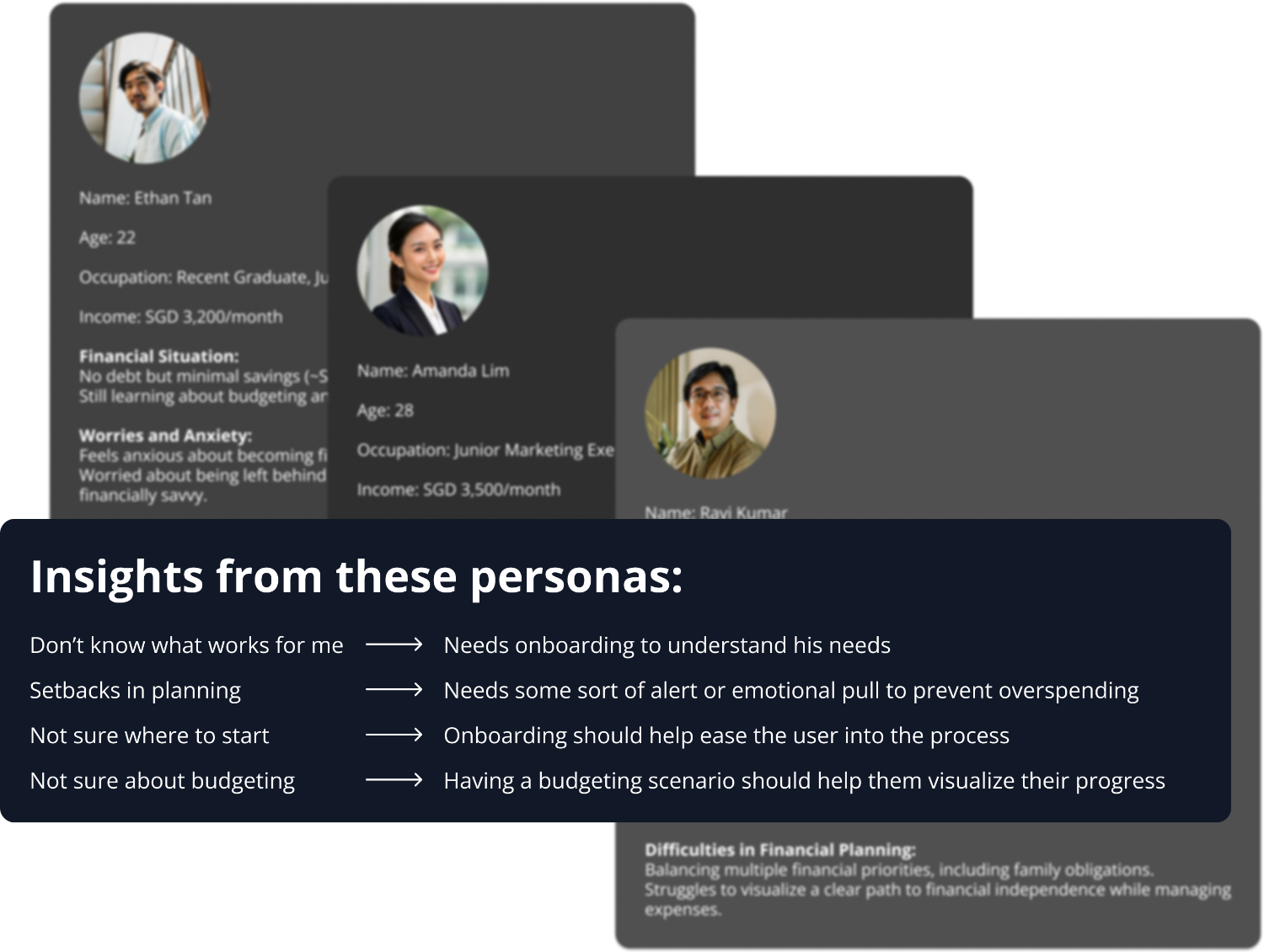
Interviewing target audience and gathering my insights
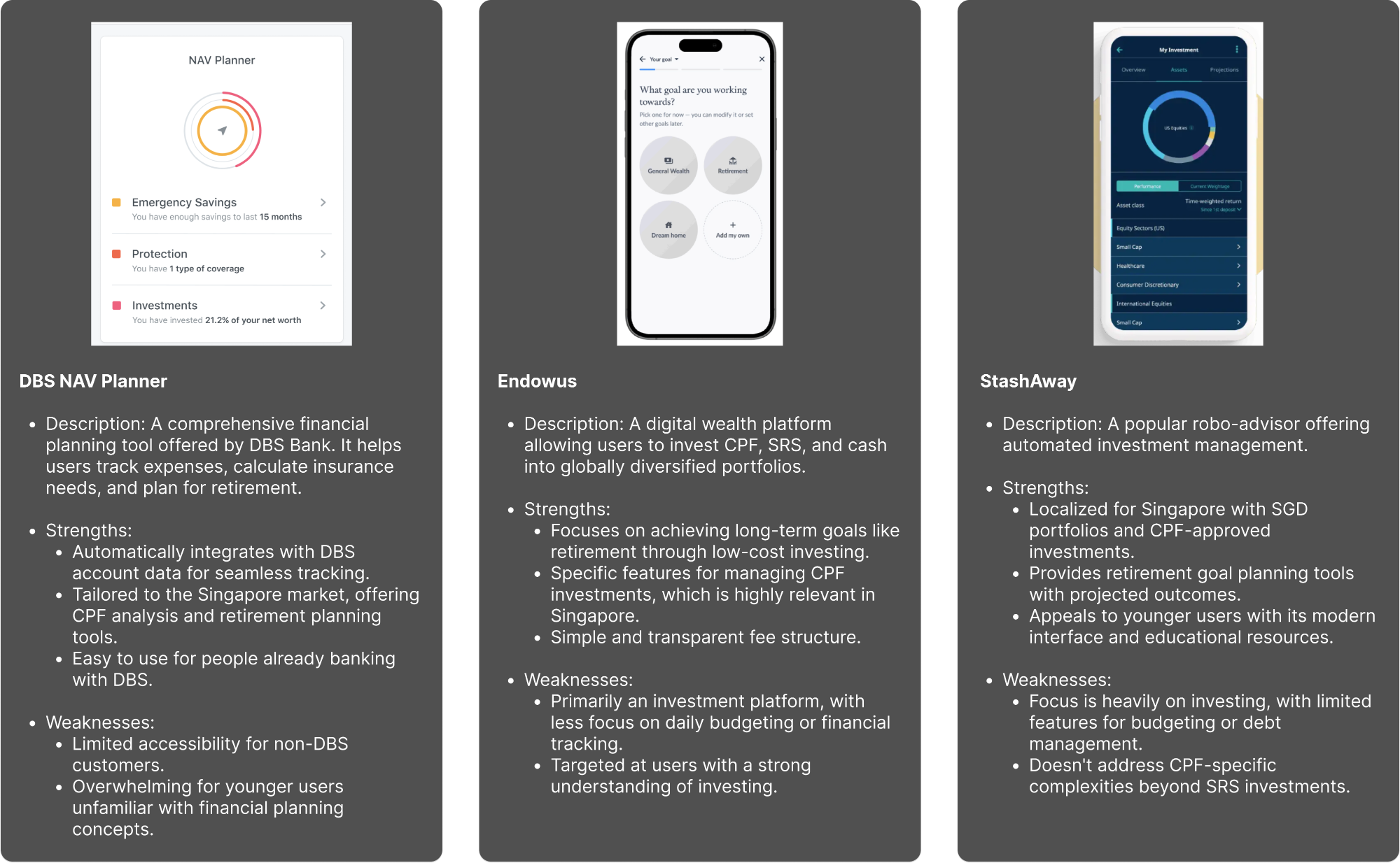
Researching other apps
Brainstorming a feature list
- Onboarding:
-
- List out their financial goals
- List out their monthly income
- Ask their investment risk appetite
- Dashboard:
- Helps them with modeling out scenarios so they know where they stand with regards to their financial goals
- Through the sliders that they can adjust (income, savings – a function of income)
- A bar chart that shows their current progress with their goals
- Goals:
- Lets user reprioritize goals
- Transactions:
- Tracks daily expenses
- Tracks savings
- Shows historical savings and expenses
- Tracks daily expenses
- Budgeting
- Makes recommendations on expenditure, savings, and investments to make
- Shows total savings, and makes recommendations on how it should be spilt up (monthly notifications to advise user how to split it up). Splitting up means splitting up into the various financial goals + an amount for investments (which is also shown as an financial goal). User has a choice – they can ignore the recommendations on splitting up, and just work towards one goal.
- Recommends what to invest in and shows portfolio performance
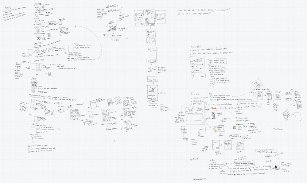
Sketches..lots of sketches..
There were two main difficulties I faced:
1. Trying to make the process of setting goals during onboarding in as few steps as possible. I feel that this step could stop a lot of users from proceeding because it requires a lot of self reflection on the user’s side- and sometimes they might just feel it’s too much bother, and quit at this point.
I mitigated this by assuring the user that they can adjust the goals later if they want to, creating a sample list to give them ideas to choose from, and letting them write their own goals if they don’t find what they want from the list.
2. The second difficulty was in planning out the mechanics of how to present the scenario planning feature, and what elements would be the most needed to plan out their budgeting scenario.
I arrived at letting the user play with monthly income and savings levels to let them have an idea how long it would take them to reach their savings goals if these two elements change.
Investment returns are dynamic, and I decided to let this not affect their saving goals because it is not possble to predict or project scenarios with this dynamic factor.
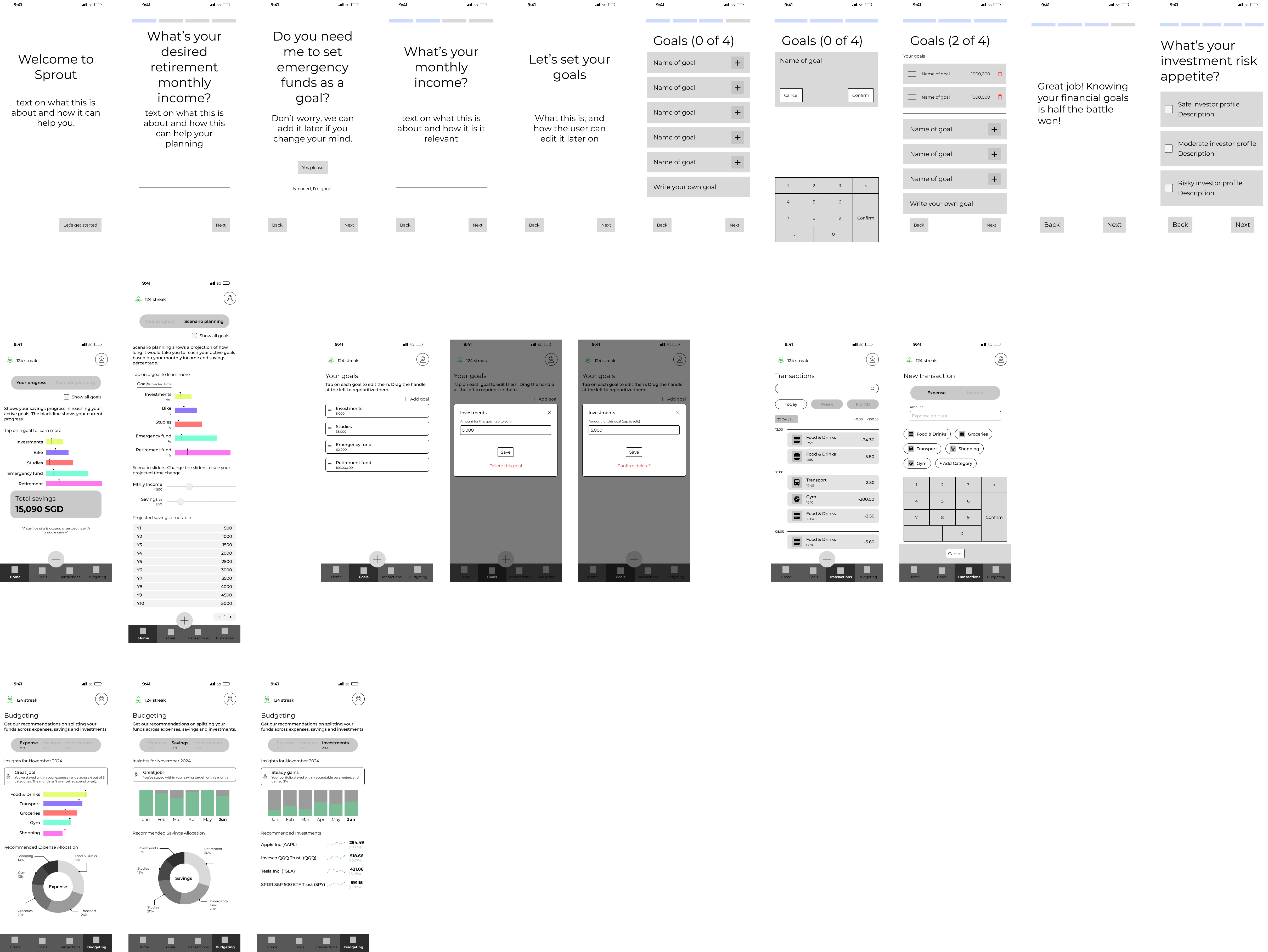
Wireframes
The goal wasn’t to make it look pretty – the goal was for me to figure out where each element was placed and where it makes sense. But, as you will see later in the finished designs, there were some elements that I shifted because I felt it would work better that way.
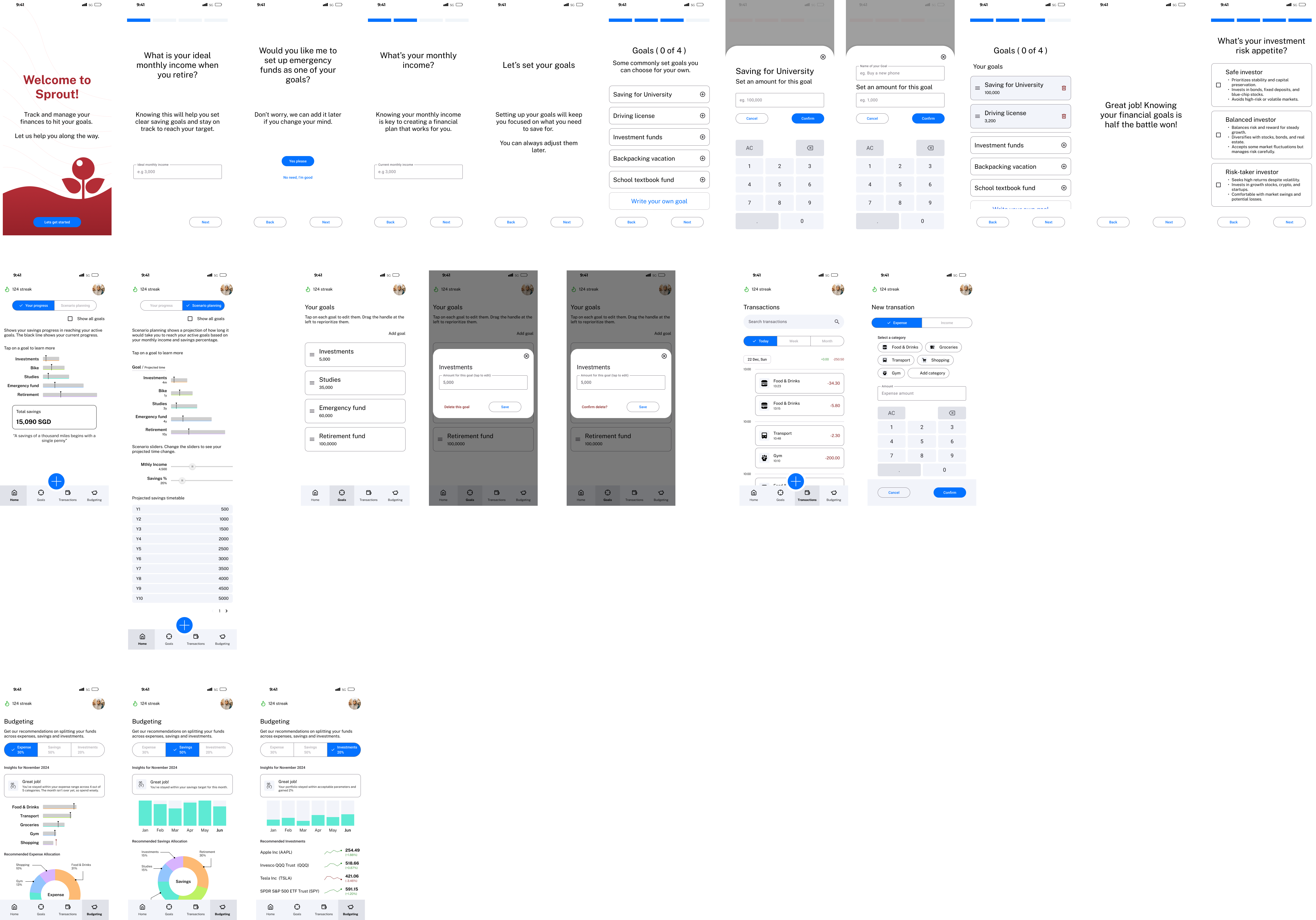
Final designs
I used a modified version of the Material 3 Design kit to create the designs and added components when I couldn’t find it in the design kit.
Conclusion
This being a concept project, I wasn’t able to get real life users to give me their opinions, besides just letting them click through a figma prototype. However, they did understand the screens and were able to navigate through the app with little difficulty.
What gave me the most problems was as mentioned earlier, designing how scenario planning can be done. I considered many different factors and features, but ultimately went for a flow that is as least confusing as I can think of – going so far as to consult many of my more mathematically inclined friends for their opinions.
If I were to do this project again, I would consider the flow of signing up with Singpass, or using CPF to invest as an option, or having insurance as another consideration. While doing this project, I was aware of the sheer mass of knowledge needed to design such an app. Definitely something that requires subject matter experts to weigh in.
I would also want to try out using other design kits.
While it took a while for me to get this project done, I learnt a lot from doing so, which is the most important thing.
Related Projects
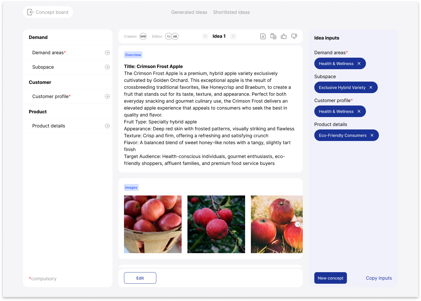
AI Copy creation App
Role
UI/UX Designer
Project Brief
Acme’s AI apps used two interface layouts—the “Pills” layout and the “Sidebar” layout. While functional, transitioning between these layouts created confusion for users.
My goal was to merge them into a cohesive interface to improve consistency and enhance the readability of AI-generated content.

Case Study: Deal Kaki x AI Prototyping
Role
UI/UX Designer
Project Brief
Deal Kaki is a conceptual project addressing the lack of a centralized platform for discovering in-store discounts. While online shopping is convenient, many still prefer in-person shopping but struggle to track discounts across brands.
The app simplifies this process, while a business dashboard provides product owners with insights into shopper engagement. Additionally, this project explored AI prototyping using bolt.new, where I refined AI-generated code to match my Figma designs.