
Role
End-to-end Product Design (Research, System Definition, Prototype)
Type
Self initiated Civic analytics concept
Duration
1 week
Constraints
Public archived dataset
Location privacy limits
Traffic Signal problem
The same complaint repeatedly occurring in the area
A small number of complaints remained open for months, repeatedly resurfacing in the same locations, making them difficult to track, prioritize, and resolve
01 - The Problem
How might we surface issues that are repeatedly reported at the same locations across New York City, so that agencies can focus on long-running problems rather than trending complaints?
Agency supervisors managing hundreds of complaints weekly have no way to distinguish a one-off report from a location that's been flagging the same issue for 18 months — in a trend dashboard, both look identical.
Issue
Trend-based dashboards prioritize spikes and recent volume
Repeated complaints in the same location appear as separate entries
Public dataset contains raw entries but no indication of a persistence metric
Recurring unresolved issues remain hidden behind short-term noise
Persistent patterns are not surfaced at a cluster level
Operational teams must manually infer recurring issues
02 - Definition of "Persistent"
A complaint is considered persistent when it is:
1
The same complaint category
2
Within a defined geo-cluster

3
> X times over Y period of time
03 - From Raw Data to Persistence Signal
1
Complaints come in from the residents
2

They are sorted into location and complaint type
3
Use color to represent persistence strength
4
Data is displayed on the dashboard
04 - My Key Decisions and Tradeoffs
Decision
Alternatives I considered
Why I chose this
Tradeoffs
Clustering complaints by grid instead of pinpoint locations
Using exact geo-coordinates
Improved privacy and persistence pattern clarity
Lower geographic precision
Showing persistence over trend-based reporting
A standard volume/time dashboard
To focus on showing recurring issues rather than short time spikes
Less emphasis on real-time complaints
Using archived data
Real-time data pulling to build the dashboard
The current dataset is comprehensive enough to demonstrate the use case for this dashboard
Data might be missing or incomplete
Using color intensity to show persistence strength
Ranking clusters numerically
Colors give the user a faster visual scan of severity
Color perception might be different across users
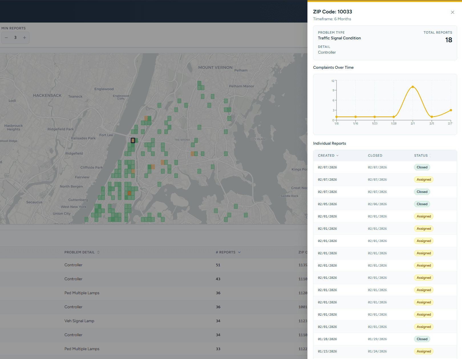
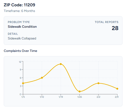
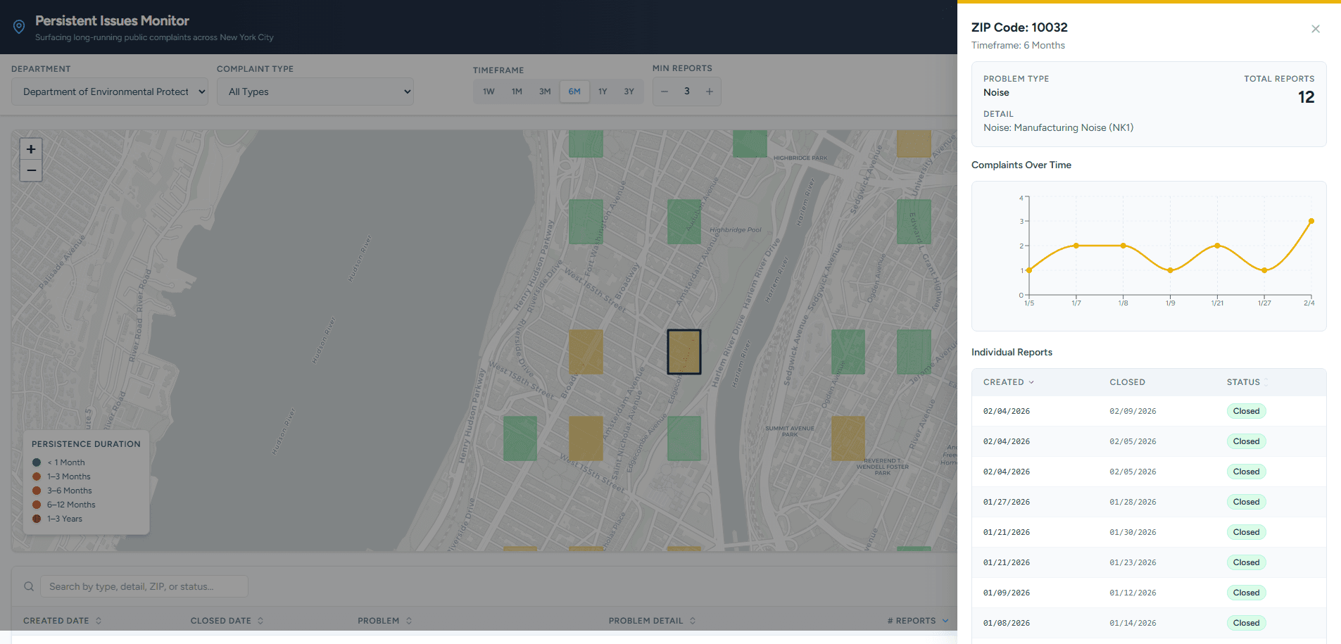
05 - What I Built

Filters let agencies define what "persistent" means for their context
Grid representation shows problem areas without false pinpoint precision
Color coding surfaces severity at a glance
Table below allows sorting and prioritization
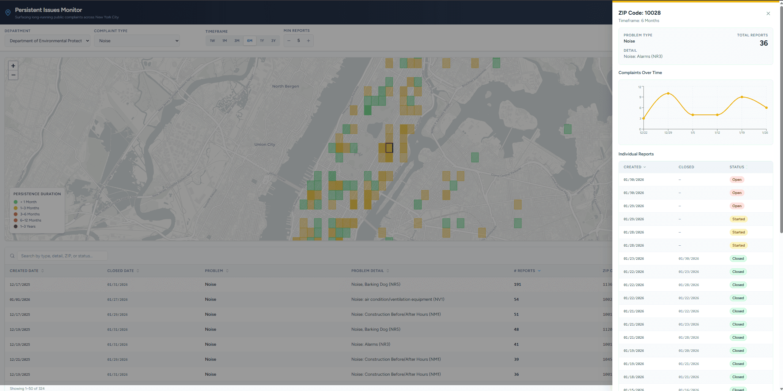
Clicking a grid opens the complaint detail panel
Timeline chart shows how complaints accumulate over time
Individual reports list shows resolution status
06 - Logic Testing
Without access to real agency users, I validated the logic through constructed scenarios rather than live testing.
Scenario
What happens in the system
Result
Rodent complaints occur 6 times in the same grid area over 30 days
System flags cluster as a persistent complaint
Dashboard surfaces this as a recurring health risk issue
Noise complaints reported for 2 days but stops after that
Does not meet persistence threshold
Dashboard doesn't show the issue
Illegal dumping happens every 2 months in the same area
Geo-cluster crosses long-term threshold
The dashboard highlights recurring enforcement issue
07 - Reflection
This project started with a question: how do agencies identify repeated, long-term issues rather than just trending ones?
Testing data early turned out to be the most important decision I made — it forced a complete pivot in scope when the data I originally planned to use wasn't available. Without that early check, I would have built the wrong thing entirely.
I also learned that visual choices carry implicit meaning. Using pinpoint map markers suggested false precision and raised privacy concerns, which led me to switch to a grid-based representation instead.
Ron Ang | 2025 | Crafted with
, powered by Framer