
Role
End to end UX Design ( Audit - Information Architecture Restructure - Prototype )
Context
Design test for B2B consulting website
Scope
Restructured and redesigned the “Use Cases” section for clarity and discoverability
Constraints
1-week turnaround, no access to internal analytics or users
01 - Business Risk
Prospects could not quickly identify relevant case studies aligned with their industry or problem.
Poor discoverability reduced the persuasive impact of case studies as sales proof points.
Friction in scanning and comparison increased the likelihood of early drop-off.
Weak case study structure risks underrepresenting the company’s expertise during evaluation.
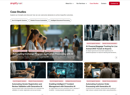
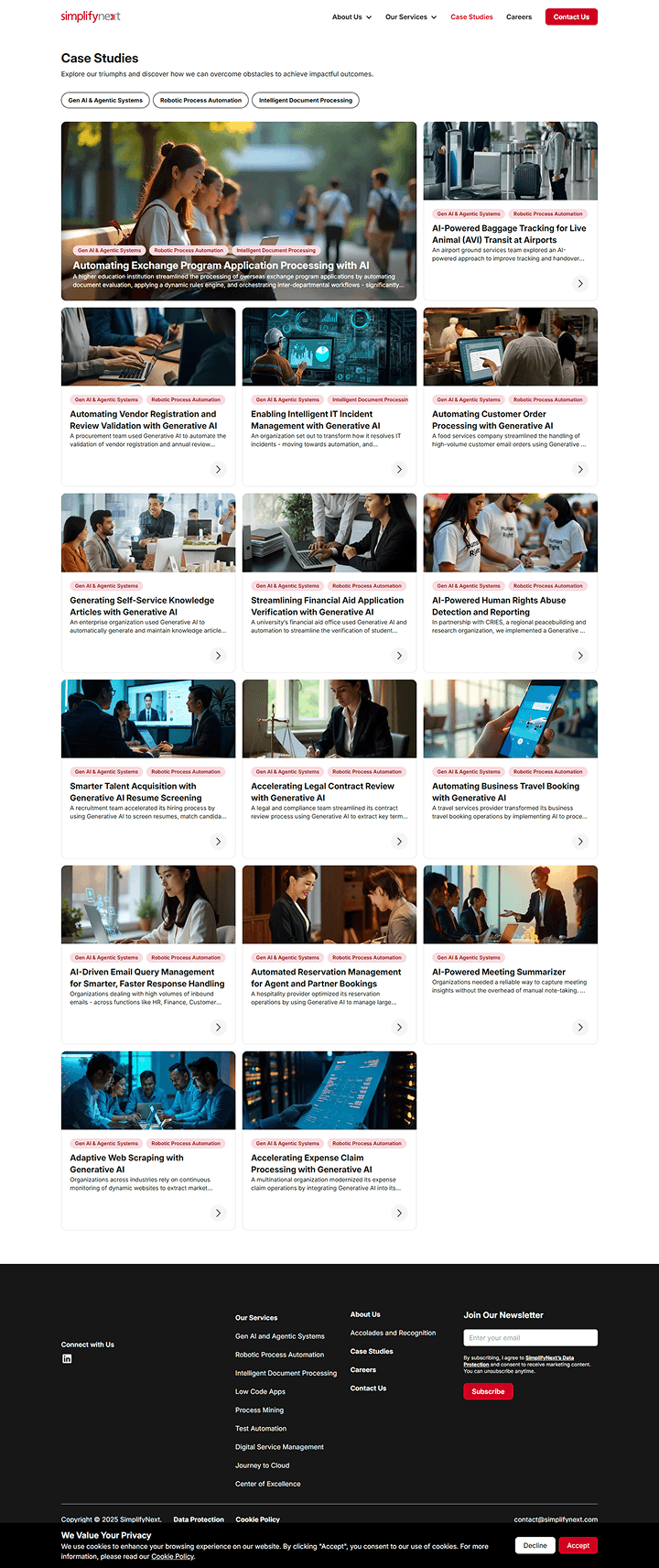
02 - Current Structural Audit
Horizontal scroll cards

Hard to see all case studies at once
Mobile card layout

No visual cue more cards exist
Footer section errors

Layout break
Inconsistent spacing
Visual error
Case study Readability
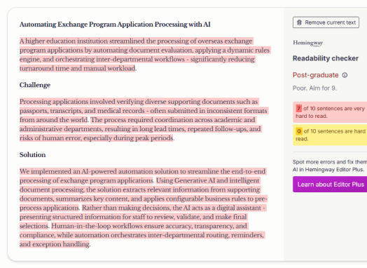
Dense paragraphs
High reading load
Low scan ability
Tags/Filters issue
Repeated tags
No hierarchy
Limited filter functionality
Issue
Structural Impact
Case study cards on the front page are partially hidden and require horizontal scrolling
Limits visibility and reduces scan ability
No clear grouping by industry or service type
Prospects cannot quickly identify examples relevant to them
Repeated tags across case studies
Filters do not meaningfully narrow results
Copy readability score is overly complex
Increases cognitive effort during evaluation
Footer errors and layout inconsistencies
Weakens perceived credibility
03 - Current structure vs Proposed structure
Shifting from flat browsing to structured discovery
Current structure
Use Cases page
Linear grid of case studies
Mixed industries
Mixed services
Overlapping tags
Proposed structure
Use Cases page
Structured filtering layer
By Solution type
By Use case
By Industry
By Department
Structured case grid
Grouped by relevance
Comparable across dimensions
04 - Classification Logic
Instead of presenting case studies as a flat grid with loosely applied tags, I reorganized them across four structured dimensions:
Solution Type (What capability is delivered?)
Use Case / Objective (What problem is being solved?)
Industry (Who is this for?)
Department (Which functional team benefits?)
Each case study is mapped across these dimensions, enabling prospects to filter by the lens most relevant to them.
Case study
Solution type
Use case
Industry
Department
Speeding Up Legal Reviews with Automated Clause Detection
Gen AI & Agentic Systems
Contract Review & Compliance
Corporate / General Enterprise
Legal & Compliance
Improving Expense Claim Turnaround by Supporting Finance with AI
Intelligent Document Processing
Expense & Claims Automation Review
Corporate / General Enterprise
Finance
Reclassifying Years of IT Incidents to Build a Smarter Ticketing System
Process Mining
Incident Management & Classification
Technology
IT / Service Management
05 - Key Decisions
Decision
Alternatives I considered
Why I chose this
Tradeoffs
Designed the “Industries We Serve” section as dynamic filter triggers instead of static navigation links.
Link each industry to a separate landing page.
Keeps the structure of the whole page while allowing quick, low-friction entry by industry.
Requires synchronization between shortcut filters and dropdown filter state.
Implemented four structured filter dimensions: Solution Type, Use Case, Industry, Department.
Refine and expand the existing tag-based system.
Structured dimensions reduce ambiguity and allow multiple discovery paths depending on user mindset.
Increased complexity in content classification and maintenance.
Replaced linear scrolling layout with a structured, filter-responsive grid.
Maintain scroll layout with improved sorting.
Improves scannability and comparison across multiple cases.
Grid layout requires clearer visual hierarchy to avoid clutter.
Rewrote case study titles to emphasize business impact over technical implementation.
Retain descriptive system-based titles.
Case study titles function as persuasive proof points
May reduce immediate visibility of technical depth at first glance.
06 - Before/After
Before
After
Flat, linear case grid
Only 3 filtering criteria
Overlapping / repetitive tags
Titles descriptive but not outcome-forward
No industry shortcut navigation

Industry icons function as dynamic filters
Multi-dimensional filtering (Solution Type, Use Case, Industry, Department)
Structured, filter-responsive grid
Clearer, more outcome-forward case titles
Added embedded contact and FAQ sections

Dense paragraphs, low scannability
No visible reading metadata
No clear hierarchy in headline
Limited use of visual data / metrics
Small, secondary related case cards

Clear, outcome-driven headline
Added publish date, reading time, share options
Rewritten copy for readability and scannability
Introduced metrics and client quotes
Integrated data visuals and structured sections
Enlarged, consistent related case cards
07 - Final designs
08 - Validation Plan
Filter Usage & Narrowing Efficiency
Measure % of users who engage with filters
Track average number of filters applied per session
Compare time-to-first-case-click before vs after
Success Indicator:
Users apply filters earlier and reach relevant case studies faster.
Case Study Engagement Depth
Scroll depth on case study pages
Time spent on page
Click-through to contact or related case
Success Indicator:
Higher engagement on filtered case views vs unfiltered browsing.
Sales Support Impact
Track case studies referenced in sales conversations
Measure conversion rate from case study page to contact form submission
Compare bounce rate from Use Cases page
Success Indicator:
Improved case study influence in prospect evaluation flow.
09 - Reflections
At first glance, this looked like a layout issue. But after mapping the content, I realised the bigger problem was how the case studies were classified and filtered.
I had no analytics access, so I had to reason through how prospects might approach the page — whether by industry, by problem, or by outcome — and structure the filters accordingly.
Converting “Industries We Serve” into a filter trigger helped preserve the overall page structure while reducing friction in discovery.
This project reinforced that clarity in structure reduces the need for visual decoration.
Ron Ang | 2025 | Crafted with
, powered by Framer